How many climbing centers ... 2?
Background
As mentioned at the end of the first part of this project, the next step was to incorporate actual geographical and socioeconomic data into the analysis to either support or reject my friend’s comments about the insufficient number of climbing centers. As an aside, I still don’t climb. I went for the first time last year. It’s definitely fun, but it’s not something I’ll think of doing in my free time.
I started this project almost 3 years ago and I finally got around to finishing the second part of this project. Since then, I was accepted into a PhD program of my dreams and have been trying to learn as much and explore as much as possible about neuroscience, computational, and mathematical theory.
With the updates out of the way, I’d like to acknowledge that I had no idea how expensive GIS data could be until I started looking for data for this part of the project. I’m very thankful to Kaggle for providing geopackage data (gpkg). I also didn’t realize how costly GIS data processing software could be, so I’m grateful for open-source packages like geopandas, folium, and overpy.

Methods and Calculations
After collecting the data, processing it can be done with a few lines of Python code. The most involved part of this project was learning how to properly query the Overpass API from OpenStreetMap through the overpy Python package. All code was written in Python and executed in a Jupyter notebook. The hardware used was a DELL XPS 15 9570 with 16GB of RAM, an Intel Core i7-8750H CPU @ 2.20GHz×12, running Ubuntu 22.04 LTS with a 64-bit architecture.
Data Collection
The geopackage data was available on Kaggle by saldenisov, while the climbing center data was queried through OpenStreetMap. All data was freely available and non-proprietary.
Data Preparation
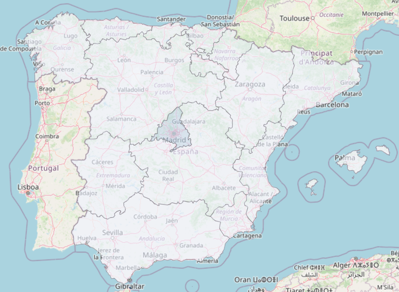
The population density data was already in a geopackage format with CRS of EPSG:4326. The climbing center data was queried from OpenStreetMap and returned in JSON format. This data was parsed and converted to a geopandas dataframe by taking the longitude and latitude of each climbing center location. They were converted to CRS EPSG:4326 format as well and then spatially joined with the population density data, associating the climbing centers to the regions given their coordinates relative to the population density data.
| GID_1 | community | code_dep | population | density | area |
|---|---|---|---|---|---|
| ESP.1_1 | Andalucía | ES.AN | 8464411 | 96 | 87268.0 |
| ESP.2_1 | Aragón | ES.AR | 1329391 | 28 | 47719.0 |
| ESP.3_1 | Cantabria | ES.CB | 582905 | 109 | 5321.0 |
| ESP.4_1 | Castilla-La Mancha | ES.CM | 2045221 | 26 | 79463.0 |
| ESP.5_1 | Castilla y León | ES.CL | 2394918 | 25 | 94223.0 |
Coordinate Systems and Projections
I want to take a moment to talk about the world of encoding geographical coordinates and how rich this area is. For the hurried reader, the code and results are at the bottom of the page along with the Jupyter notebook. Interestingly, the only times I’ve ever thought about the problem of recording the locations of something spherical or onto a plane was in a Human Geography course that I took in high school, specifically, the Mercator projection.
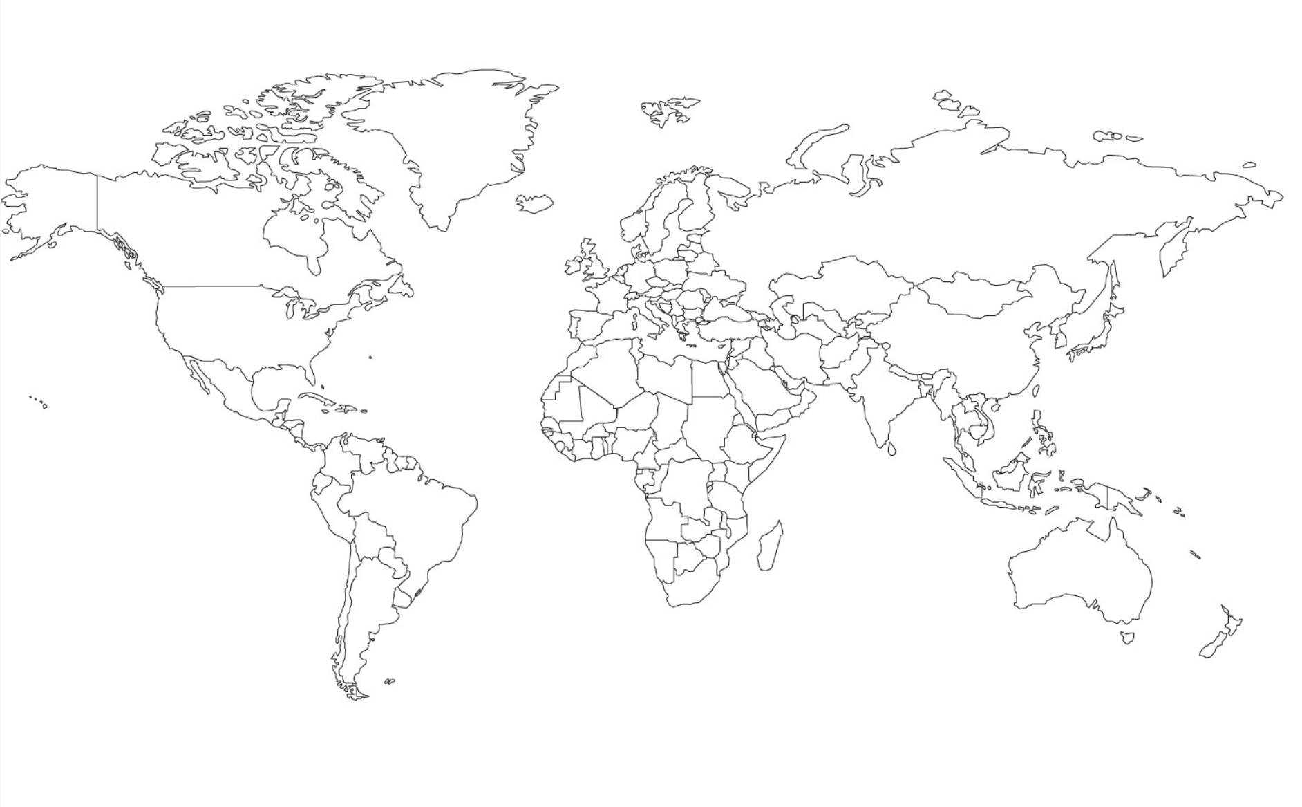
In class, we discussed the difficulty of representing a sphere on a plane and how the Mercator projection tries to solve this problem by trading off the area and shape of the Earth for distance.

Thanks to people on the internet who think learning is cool (and stackexchange for the picture above), there are websites that let people play with these distortions to gain an intuition about how much larger or smaller countries are in reality when compared to what is found on a map. The website www.thetruesize.com/ went viral around 2017 for this reason.
We can think of the coordinates of the points on the Earth locally as x and y coordinates. This makes sense because, if you go outside, the Earth around you looks flat. In fact, even from space, the Earth looks flat. However, the Earth is not flat, which is most easily reasoned by noticing that one cannot see the Great Wall of China from New York City (or even from the moon). There are other reasons, as shared here in a response to a student’s question from ASU. This relation between the Earth being flat around us (locally) yet spherical (globally) begs the question of how to flatten something round onto something flat without losing too much information.
Using our current location as a reference, we use x and y coordinates. I can tell my friend Jane that I’m located somewhere on the surface of the Earth by giving her a coordinate pair. Although this coordinate pair is helpful, it depends on where Jane and I are. If we are nearby, this approximation is sufficient and is what motivates some city layouts like Chicago. However, if Jane is currently touring the Great Zimbabwe ruins and I’m eating BBQ in Austin, not only is our approximation bad, but we also have to figure out which of us will be the zero point!
We can overcome this by both agreeing to use a common reference point and a common coordinate system. This is naturally done by picking the center of the Earth as the reference point and agreeing to convert our x and y coordinates into degrees relative to the equator and the prime meridian of the Earth. Concretely, these are the longitude and latitude, and the conversion can be done using the Haversine formula.
The Haversine formula is given by:
$$ a = \sin^2\left(\frac{\Delta\phi}{2}\right) + \cos(\phi_1)\cos(\phi_2)\sin^2\left(\frac{\Delta\lambda}{2}\right) $$$$ c = 2\cdot\text{atan2}\left(\sqrt{a}, \sqrt{1-a}\right) $$$$ d = R\cdot c $$where:
- \(\phi_1\) and \(\phi_2\) are the latitudes of the two points
- \(\Delta\phi\) is the difference between the latitudes
- \(\Delta\lambda\) is the difference between the longitudes
- \(R\) is the radius of the Earth (e.g., 6371 km for kilometers)
The formula calculates the great-circle distance between two points on a sphere given their latitudes and longitudes. The result, $d$, is the distance between the two points in the same units as the radius of the Earth. A really cool post about this can be found here
It seems like we’ve solved our problem. Clearly, sailors carried massive spheres and tables with them to perform conversions and calculations, right? Well, not quite. The Haversine formula is great for calculating distances between two points on a sphere, but it doesn’t help us with the problem of representing the Earth on a flat surface. Indeed, we now have a common language for discussing locations on the sphere, but how is Jane to give me directions to meet her at the Great Zimbabwe ruins?
There are many other different projections, as well as connections to homeomorphisms and diffeomorphisms from the sphere to other spaces, which I’ll discuss in a separate post about these connections and geometries in the future.
Results
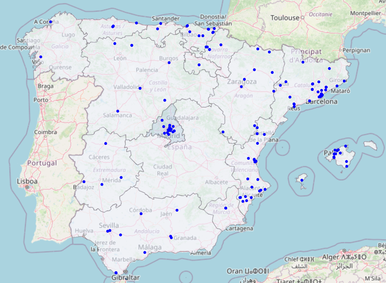
The final map of the climbing centers in Spain from the query is provided in the figure below.

The map was made using the Python library folium.
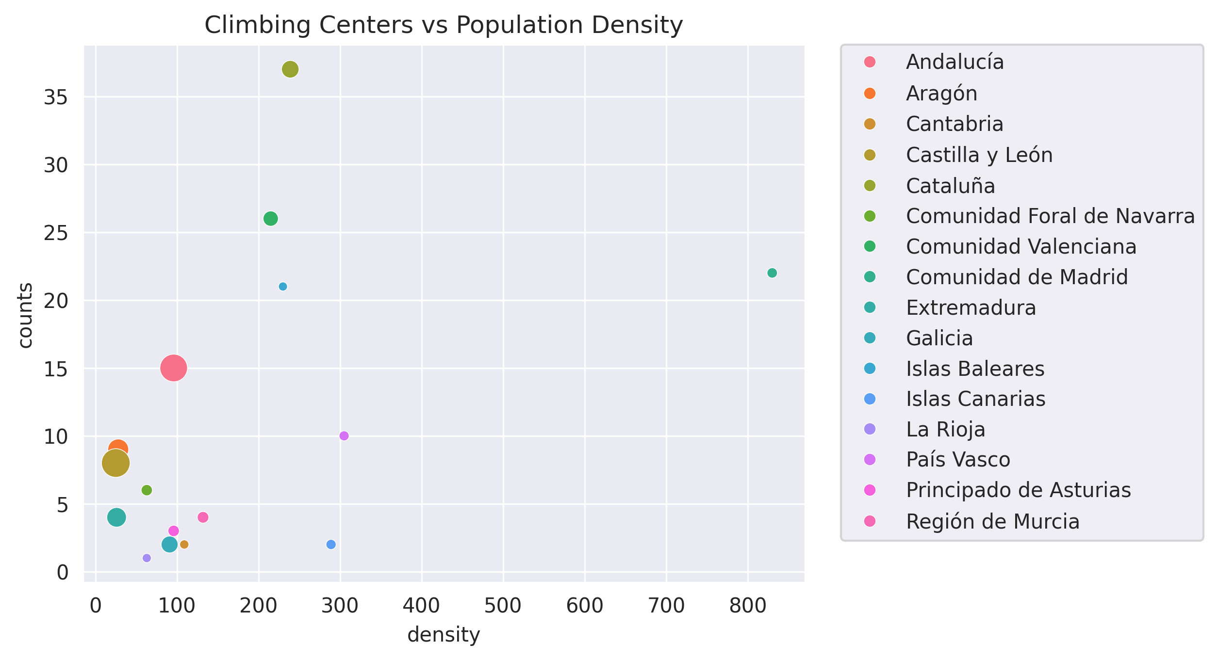
Through the spatial join of the data sets, we get the following counts of the number of climbing centers:
| community | counts | density | area |
|---|---|---|---|
| Andalucía | 15 | 96 | 87268.0 |
| Aragón | 9 | 28 | 47719.0 |
| Cantabria | 2 | 109 | 5321.0 |
| Castilla y León | 8 | 25 | 94223.0 |
| Cataluña | 37 | 239 | 32114.0 |
| Comunidad Foral de Navarra | 6 | 63 | 10391.0 |
| Comunidad Valenciana | 26 | 215 | 23255.0 |
| Comunidad de Madrid | 22 | 830 | 8028.0 |
| Extremadura | 4 | 26 | 41634.0 |
| Galicia | 2 | 91 | 29574.0 |
| Islas Baleares | 21 | 230 | 4992.0 |
| Islas Canarias | 2 | 289 | 7447.0 |
| La Rioja | 1 | 63 | 5045.0 |
| País Vasco | 10 | 305 | 7234.0 |
| Principado de Asturias | 3 | 96 | 10604.0 |
| Región de Murcia | 4 | 132 | 11313.0 |
Which we can view as:

Discussion
It’s possible that some climbing centers were missed or that too many centers were included. Using only the queries that the location must be both a place where climbing is practiced and used for leisure as a sports center may have excluded places where competitive rock climbing is practiced.
Code:
All code is available in this github repo: